The debate surrounding Taipower’s recent corporate identity reboot has gone well beyond the design community. The controversy began after Taipower replaced the familiar “Taiwan Power Company” wording — widely regarded as the calligraphy of Yu You-ren (1879-1964), former Control Yuan president and master calligrapher — with a modern logotype by designer Aaron Nieh’s team, Aaron Nieh Workshop. Taipower said the change was not a wholesale replacement of old signage, but an “optimization of its identity system,” aimed at meeting the needs of digital media, electronic bills, apps, social media graphics and various small-format applications. Existing physical markings, such as building signs, manhole covers and vehicle decals, will not be immediately replaced. The tender for the project was worth NT$968,940, quickly leading to a debate on whether it was reasonable to spend nearly NT$1 million “just to change six Chinese characters.”
The controversy can be divided into three levels. The first concerns the gap between design professionalism and public perception. Supporters argue that corporate identity is not simply a matter of “changing a font,” but involves a standard logotype, logo proportions, digital application guidelines, legibility and overall visual consistency. The logo of a large state-owned enterprise appears on bills, Web sites, apps, uniforms, vehicles, official documents, presentations and public facilities, so it must remain consistent across different sizes and media. Nieh also responded that the original identity had problems with legibility in small formats and digital settings. The new design, he said, was intended to make Taipower more recognizable in contemporary media, rather than a simple revamp of the old logo.
The second issue concerns historical memory and cultural symbolism. Many people oppose the change because the original calligraphic wording had long been tied to Taipower’s image, carrying public memory and cultural sentiment. As Yu was an important modern calligrapher, his script is also seen as part of the Republic of China’s aesthetic tradition and the visual heritage of public institutions. For this reason, some critics have interpreted the replacement as an erasure of history, a weakening of cultural depth, or even politicized it as a symbolic act of “de-Sinicization” or “transitional justice.” However, another layer of historical dispute has also emerged: Nieh said the original wording was not a complete inscription Yu personally wrote for Taipower, but was instead assembled from Yu’s calligraphy samples, then rearranged, resized and replicated. Some reports also suggest that the actual Yu inscription once used by Taipower may have been replaced by an imitation or reproduction as early as the 1990s. This has shifted the debate from whether Yu’s calligraphy should be preserved to whether the Yu-style version was ever an original work in the first place.
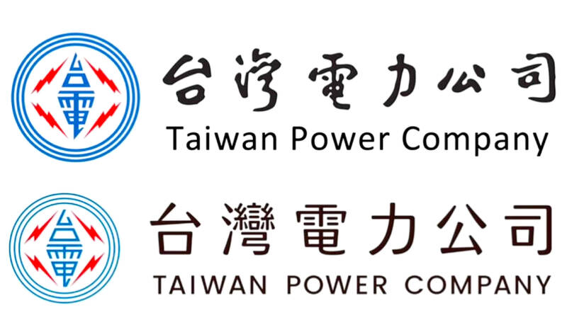
Photo: Screen grab from the Internet 照片:擷圖自網路
The third issue involves public funds, politics and the governance of state-owned enterprises. Critics point out that Taipower has faced financial pressure and controversy over electricity prices in recent years, making its decision to spend nearly NT$1 million on corporate identity open to accusations of being wasteful. Some have also questioned Nieh’s previous design work for government or public institutions, linking the case to political affiliation and labeling him as part of a “green-friendly” network. Supporters counter that nearly NT$1 million is not unusually expensive for a large-scale corporate identity system, and that the real issue should not be reduced to “how much six characters cost,” but should instead be evaluated in terms of the design scope, duration of use, application scenarios and future maintenance benefits.
In sum, while the controversy appears on the surface to be a dispute over the aesthetics of Taipower’s standard logotype, it actually reflects three recurring difficulties in public branding in Taiwan: how society understands design professionalism; how the historical symbols of public institutions can be preserved or translated in the digital age; and whether state-owned enterprises should provide fuller explanations of their decision-making, design scope and strategy for old-and-new coexistence when spending public money to update their image. Taipower does have a real need to optimize its digital identity. But when a change involves public memory familiar to the entire society, clearer prior disclosure of the design rationale, historical research and application guidelines might have reduced accusations of “quietly replacing symbols” or “wasting public funds.” This incident is therefore not merely a logo controversy, but a concentrated collision between public aesthetics, cultural memory and political trust in Taiwan.
(Lin Lee-kai, Taipei Times)
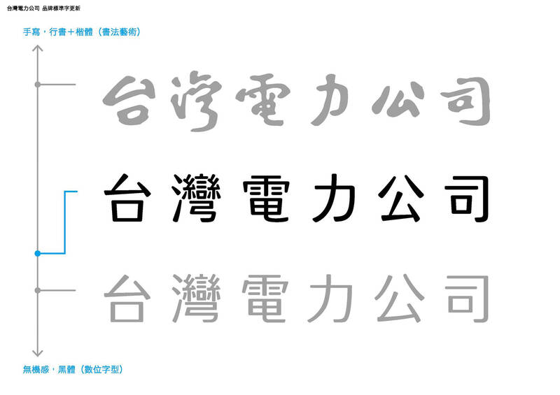
Photo: Screen grab from Aaron Nieh’s Facebook page 照片:擷圖自聶永真臉書
台電近日更換企業識別,引發一場超出設計圈的公共爭論。事件起因是台電將原本大眾熟悉的于右任(1879-1964)書法「台灣電力公司」字樣,改為由設計師聶永真團隊「永真急制設計工作室」重新設計的現代標準字。台電表示,這次並非全面拆換舊招牌,而是「識別系統優化」,目的在於因應數位媒介、電子帳單、App、社群圖像與各式小尺寸應用的需求;既有建築招牌、孔蓋、車輛等實體標示不會立即汰換。相關標案金額為新台幣96萬8940元,使輿論迅速聚焦在「是否花近百萬元改六個字」的問題上。
爭議可分為三個層次。第一是設計專業與公共認知的落差。支持者認為,企業識別不是單純「改字體」,而是包含標準字、Logo比例、數位應用規範、辨識度與整體視覺一致性;對大型國營企業而言,標誌會出現在帳單、網站、App、制服、車輛、公文、簡報與公共設施上,因此需要在不同尺寸與媒介中保持清楚。聶永真也回應,原識別在小尺寸或數位場景中有辨識困難,新版設計是為了讓台電在當代媒介中更穩定、清楚地被識別,而不是推翻舊標誌。
第二是歷史記憶與文化象徵的問題。許多人反對更換,是因為原本的書法字樣長期與台電形象綁在一起,具有公共記憶與文化情感。于右任作為近代重要書法家,其字體也被視為中華民國美學與公共機構視覺傳統的一部分,因此更換字樣被部分批評者解讀為抹除歷史、破壞文化底蘊,甚至被政治化為「去中國化」或「轉型正義」式的符號替換。不過,事件中也出現另一層考證爭議:聶永真稱原字樣並非于右任為台電完整親題,而是取自于右任字帖後重新排列、縮放、描圖而成;也有報導指出,台電早年真正使用的于右任題字版本,可能早在1990年代左右已被替換為臨摹或再製版本。這使爭論從「要不要保留于右任」進一步變成「我們記憶中的于右任版本究竟是不是原作」。
Photo courtesy of a reader 照片:讀者提供
第三是公帑、政治與國營事業治理的爭議。批評者指出,台電近年面臨財務壓力與電價爭議,卻花近百萬元做企業識別,容易被視為浪費;也有人質疑聶永真過去曾承接政府或公共機構設計案,將事件連結到政治立場與「綠友友」標籤。支持者則反駁,近百萬元對一套大型企業識別系統而言並非異常高價,真正問題不應被簡化成「六個字多少錢」,而應評估設計範圍、使用年限、應用場景與後續維護效益。
總結來看,這場爭論表面上是台電標準字美醜之爭,實際上反映台灣公共品牌更新時常遇到的三個難題:一是設計專業如何被社會理解;二是公共機構的歷史符號如何在數位化時代被保存或轉譯;三是國營事業在花費公帑更新形象時,是否需要更完整說明決策理由、設計範圍與新舊並存策略。台電確實有數位識別優化的需求,但當改動涉及全民熟悉的公共記憶時,若事前能更清楚公開設計說明、歷史考證與應用規範,或許能降低「偷換符號」與「浪費公帑」的質疑。這起事件因此不只是Logo風波,而是台灣公共美學、文化記憶與政治信任之間的一次集中碰撞。
(台北時報林俐凱)
Photo: CNA 照片:中央社

Have you ever wondered how people navigate the world when they can’t see a map? For individuals with visual impairments, conventional maps are nearly impossible to use. This is where tactile maps come in — essential tools that allow people to “see” the world through touch. A tactile map is specially designed with raised lines, textures, and symbols to represent geographical features such as roads, rivers, and buildings. Users explore it with their fingertips. However, these maps are not exclusively for people with visual disabilities. They serve as valuable multisensory learning tools that enhance spatial understanding for everyone, making

A: In early May, there were concerts by Icyball, Chyi Yu, Korea’s EXO and Japan’s Anisama, but I missed them all. What a shame. B: That’s OK. There are shows coming up by various artists, including Power Station, Accusefive, Japanese singer Mika Nakashima, Chinese-Icelandic jazzer Laufey, and even Singaporean diva Stefanie Sun. A: After a 12-year hiatus, Stefanie is finally returning to Taipei again. B: In late May, there will be more shows by Crowd Lu, WeiBird, Korea’s Donghae, 2AM, EXID, and Thailand’s BUS. A: The Thai boyband is so popular. It looks like “T-pop” is catching up with J-pop

Since 2005, the third Monday in January has come to be known as “Blue Monday.” In other words, that day is believed to be the most depressing day of the year. This concept seems logical at first. After all, Monday marks the start of the school or workweek after two days of rest and fun. Also, blue is a color that is often associated with sadness. Furthermore, in many parts of the world, January is a time when the weather is cold, rainy, and gloomy. But is there any scientific proof that this January day is truly sadder than any of

Continued from yesterday(延續自昨日) https://www.taipeitimes.com/News/lang For the most part, the idea of “Blue Monday” has been rejected as a myth. Some mental health experts also say there is a danger in labeling a certain day as the most depressing time of the entire year. Some argue that if people expect to feel sadder on the third Monday in January, this belief alone may increase their anxiety. One group that is worried about the negative effect of believing in Blue Monday is Samaritans. A mental health charity based in the UK, Samaritans is working to turn Blue Monday into “Brew Monday.” In this