In the film Pleasantville (1998) the staid world of a black-and-white 1950s town is upended by the introduction of color. Something similar is happening at the Museum of Modern Art in Manhattan.
In the upper section of the lobby, a floor created by the artist Jim Lambie surrounds Auguste Rodin's sculpture of Balzac with concentric strips of brightly hued tape. Up on the sixth floor, a painted-aluminum construction by Donald Judd gives a lift to the gray towers visible through the skylight. Cheerful striped vests, designed by Daniel Buren, peek out from the regulation charcoal jackets of the museum guards.
These and other interventions are part of Color Chart: Reinventing Color, 1950 to Today, which opened at the museum on Sunday. Organized by Ann Temkin, a curator in the museum's department of painting and sculpture, Color Chart looks at contemporary artists for whom color functions as a ready-made - something to be bought or appropriated, rather than mixed on a palette. As Frank Stella famously quipped, "I tried to keep the paint as good as it was in the can."
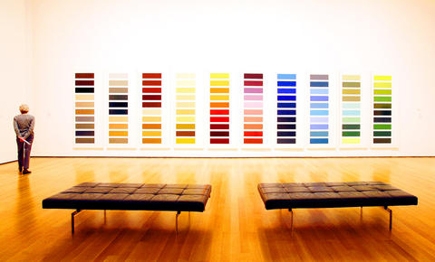
PHOTO: NY TIMES NEWS SERVICE
The show is a rejoinder to the notion of color as the province of formalists, and to the idea that Minimal and Conceptual art comes only in shades of black, white and gray. That Color Chart coincides with Jasper Johns: Gray at the Metropolitan Museum is a happy accident; in that show the pairing of Johns' red, yellow and blue painting False Start and its neutral counterpart Jubilee amounts to a Pleasantville experience in reverse.
Temkin's thesis owes much to the British artist and writer David Batchelor, whose book Chromophobia (2000) is a thorough and witty cultural history of color, including in its thematic discussions Heart of Darkness and the movie version of The Wizard of Oz. Regrettably, photographs from Batchelor's series Found Monochromes of London, a visual diary of white rectangles glimpsed during his daily travels, have been tucked away near the museum's sixth-floor bathrooms.
As Batchelor writes: "The color chart divorces color from conventional theory and turns every color into a ready-made. It promises autonomy for color; in fact, it offers three distinct but related types of autonomy: that of each color from every other color, that of color from the dictates of color theory and that of color from the register of representation." In other words, we are far from Johann Wolfgang von Goethe's Theory of Colors and from the deceptive relationships of Josef Albers' homages to the square.
This show's first gallery makes the novelty of autonomous color gloriously apparent. A series of signature works by Ellsworth Kelly, from 1951, shows him experimenting with randomly generated patterns of squares cut from store-bought colored paper. One of these collages gave rise to the contemporary masterpiece Colors for a Large Wall, a stunning, nearly 2.4m2 grid composed of 64 separate canvases.
Kelly may be an obvious choice, as are Yves Klein, Andy Warhol and Stella, but the inclusion of Robert Rauschenberg's Rebus (1955) offers a fresh angle on an artist whose color choices are rarely, if ever, analyzed. One of his early "combine" paintings, it includes a horizontal spectrum of cardboard paint samples. More to the point, it contains splashes of colors purchased in unlabeled cans from surplus stock on the Bowery.
In one of many fascinating anecdotes in the exhibition catalog, Rauschenberg recalls: "It was like 10 cents for a quart can downtown, because nobody knew what color it was. I would just go and buy a whole mess of paint, and the only organization, choice or discipline was that I had to use some or all of it, and I wouldn't buy any more paint until I'd used that up."
As subsequent galleries reveal, European artists under the spell of Rauschenberg and John Cage developed their own strategies for liberating color from aesthetic intent. An entire wall is devoted to Gerhard Richter's Ten Large Color Panels (1966-1972), a 9.4m sequence that elevates hardware-store paint chips to monumental proportions.
Many of the show's artists look to the automobile industry for an explicitly commercial palette, one best captured by the Tom Wolfe essay The Kandy-Kolored Tangerine-Flake Streamline Baby. Color Chart includes John Chamberlain's suite of album-size paintings, made with car lacquer on Masonite and Formica; Alighiero Boetti's monochromes made in Turin, Italy, with Fiat motorcycle enamel; and Jan Dibbets' photographs of car hoods.
Color Chart suffers, in places, from the visual redundancy of its many chart-based works. Strained viewers can rest their eyes on Lawrence Weiner's wall text invoking permutations of red, green and blue, or Sol LeWitt's ethereal wall drawing composed of thin lines of colored pencil.
Other welcome distractions include works by lesser-known Europeans, several of whom practice a romantic strain of Conceptualism. In a video performance conceived as a homage to Piet Mondrian, the Dutch-born artist Bas Jan Ader separates bouquets of flowers into orderly bunches of uniform color. Sectioned wooden bars by Andre Cadere, propped casually against the museum's walls, were once carried into the cafes, subways and galleries of 1970s Paris in a peripatetic hybrid of sculpture and performance.
Artists working some 20 years after Kelly's cut-paper experiments still had to contend with art schools that emphasized formal color training. The anti-Albers backlash finds its most concise expression in Richard Serra's Color Aid (1970-1971). In this 36-minute film, Serra (who studied with Albers at Yale) leafs through a packet of 220 colored papers with the flourish of a doctor tearing off a sheet from his prescription pad.
The final section of the show, devoted to art since 1990, feels less inspired. The neutrality of the color chart is predictably violated, first in a 1998 series of paintings by Mike Kelley that form a grid with covers of the bawdy-humor magazine Sex to Sexty, and later in two of Damien Hirst's ubiquitous spot paintings.
The most recent works acknowledge that our experience of color is increasingly mediated by corporations and consultancies, like Pantone and the Color Marketing Group. Angela Bulloch's hypnotic light box Standard Universal 256: CMY (Cyan) (2006) flashes through each color of the palette used by the Macintosh OS9 operating system.
The show's newest piece is also, in some ways, one of the oldest. Sherrie Levine's Salubra No.4 (2007) consists of 14 monochrome paintings displayed against a gray background. Levine has taken the colors from a line of painted wallpaper created in 1931 by Le Corbusier - the architect better known as an advocate of pristine white Ripolin paint.
As Batchelor writes, "Chromophobia is perhaps only chromophilia without the color."
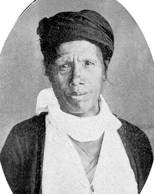
May 11 to May 17 Traversing the southern slopes of the Yushan Range in 1931, Japanese naturalist Tadao Kano knew he was approaching the last swath of Taiwan still beyond colonial control. The “vast, unknown territory,” protected by the “fierce” Bunun headman Dahu Ali, was “filled with an utterly endless jungle that choked the mountains and valleys,” Kano wrote. He noted how the group had “refused to submit to the measures of our authorities and entrenched themselves deep in these mountains … living a free existence spent chasing deer in the morning and seeking serow in the evening,” even describing them as
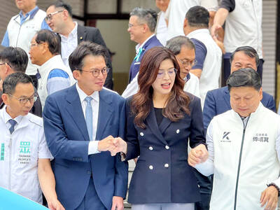
As a different column was being written, the big news dropped that Chinese Nationalist Party (KMT) caucus whip Fu Kun-chi (傅?萁) announced that negotiations within his caucus, with legislative speaker Han Kuo-yu (韓國瑜) of the KMT, party Chair Cheng Li-wun (鄭麗文), Taichung Mayor Lu Shiow-yen (盧秀燕) and Taiwan People’s Party (TPP) Chair Huang Kuo-chang (黃國昌) had produced a compromise special military budget proposal. On Thursday morning, prior to meeting with Cheng over a lunch of beef noodles, Lu reiterated her support for a budget of NT$800 or NT$900 billion — but refused to comment after the meeting. Right after Fu’s

Yesterday, the Democratic Progressive Party (DPP) nominated legislator Puma Shen (沈伯洋) as their Taipei mayoral candidate, the Chinese Nationalist Party (KMT) put their stamp of approval on Wei Ping-cheng (魏平政) as their candidate for Changhua County commissioner and former legislator Tsai Pi-ru (蔡壁如) of the Taiwan People’s Party (TPP) has begun the process to also run in Changhua, though she has not yet been formally nominated. All three news items are bizarre. The DPP has struggled with settling on a Taipei nominee. The only candidate who declared interest was Enoch Wu (吳怡農), but the party seemed determined to nominate anyone
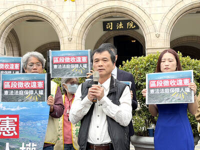
What government project has expropriated the most land in Taiwan? According to local media reports, it is the Taoyuan Aerotropolis, eating 2,500 hectares of land in its first phase, with more to come. Forty thousand people are expected to be displaced by the project. Naturally that enormous land grab is generating powerful pushback. Last week Chen Chien-ho (陳健和), a local resident of Jhuwei Borough (竹圍) in Taoyuan City’s Dayuan District (大園) filed a petition for constitutional review of the project after losing his case at the Taipei Administrative Court. The Administrative Court found in favor of nine other local landowners, but